

Visual design
The media inside the learning: brand kit, video, icons and print.
How I approach it.
Select any item to reveal the detail.
A palette, type scale and component kit documented for the authoring tools in use, so every module ships recognisably on brand. Templates cover the screens built most often: title, content, scenario, quiz, summary. New team members inherit the standard instead of reinventing it.
SME decks re-scripted for the screen and rebuilt to one visual standard. Dense paragraphs become structured screens; decorative clip art becomes graphics that carry meaning. The expertise stays, the noise goes.
Filming, editing, captions and on-screen annotation, delivered in the formats the platform needs. Motion graphics take over where cameras cannot go: processes, systems, anatomy. Accurate captions ship as standard, not as an extra.
Custom icon sets and illustration where stock imagery would say nothing. Drawn to the brand, exported at every resolution needed, and reusable across future modules so the investment compounds.
Quick-reference guides, workbooks and handbooks designed to survive the desk drawer. Print-ready files with proper bleeds, plus a digital version for the intranet. The course ends; the reference stays.
Proof.
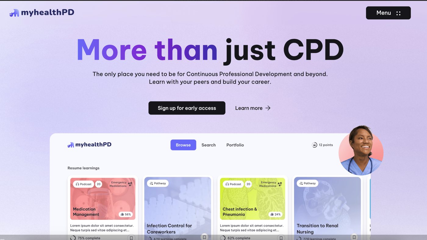 myhealthPD.